History
The NixOS logo was originally designed by Simon Frankau for Haskell as part of the 2009 Haskell logo contest. Simon kindly gave permission for the design to be used by the NixOS project, and it was made official in November 2009. In 2015, a new version of the logo with a “hexagon design” was created by Tim Cuthbertson and added to the homepage. In March of 2017, it officially superseded the previous logo and was added to the nixos-artwork repository. Over the years, there have been many updates to the logo and repository, including:
- Converting the logotype to paths, removing the dependency on users having the designated font installed.
- Adding documentation about the font used to create the logotype, guide layers, and colors
- Introducing various logo variants, including a vertical variant, an all-white variant, and a rainbow variant
Motivation to change
An incredible amount of work has gone into creating and improving the logo and its documentation. However, it suffers from some inconsistencies and many parts of it are still ambiguous.
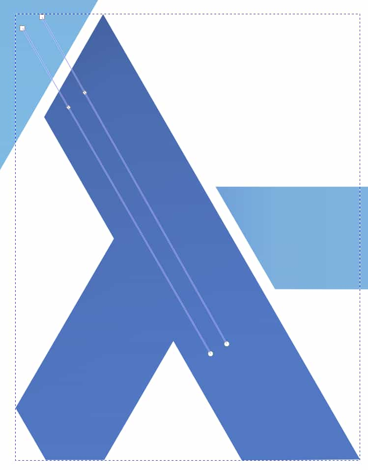
The image below is a zoomed in view of the bottom of the NixOS logo with a horizontal line drawn starting at the bottom left of the snowflake.
If you open the image and zoom in, you will see that the edges of the snowflake are not parallel to the horizontal line.
Additionally, the edges of the snowflake are not collinear with each other.

The image below shows the paths that define the gradient for the lambdas. There are two gradient definitions that are different and ideally they would be the same.
When creating a brand guide, there are usually sections describing the anatomy of the logo, clearspace, sizing, alignment, variations, and misuse. Some of this information has been captured in the README co-located with the logos but not all of it is well defined. For example:
- The anatomy of the logo is not well defined which should include information like the relative size of the logomark and logotype and the spacing between them.
- The anatomy of the logomark is not well defined which should include information like the dimensions of the lambdas and the gap between lambdas.
- The anatomy of the logotype is not well defined which should include information like spacing between glyphs.
- The paths used to define the gradients of the lambdas are not well defined and are different.
- The clearspace around the logo and logomark is not well defined.
- The clearspace around the logo and logomark is not sufficient.
- There are no guidelines about sizing and alignment.
- There is no variation of the logotype by itself.
- There are no guidelines about creating new variations.
- There are no guidelines about misuse.
Work towards improvement
To address these issues, I want to improve how we create logos, create a Branding Guide, and create a Media Kit. Before I started any design work, I tried to find a tool that would satisfy my 2 requirements:
- I have to be able to design the logo parametrically.
- I have to be able to generate SVG files programmatically.
The idea behind the first requirement was that I want to be able to reduce the creation of the logo to a few simple parameters. Additionally, if I can generate the SVG files programmatically, I can programmatically generate the Branding Guide and Media Kit. I’m calling this approach “Branding as Code” (BaC)
I surveyed many FOSS image editing and CAD tools but none of them could satisfy both my requirements. In the end, I decided to create my own tooling in Python. After three months of work the tooling has a lot of capabilities. It can:
- Generate a lambda based on 3 parameters: radius, thickness, and gap.
- Generate a logomark with different colors and color styles.
- Generate a logotype with different colors and styles.
- Generate a logo (logomark + logotype) in different layouts.
- Generate all three logo products with different clearspace values and meaningfully unique filenames.
- Generate dimensioned and annotated SVG files for use in the Branding Guide.
A few example output products are shown below.


All of these efforts - and the ones still underway - are being done to serve the community, which truly deserves to be treated as a mature and important organization. In today’s world, a clear visual identity and coherent narrative are must-haves for any serious project. Meeting the requirements of modern communication and marketing practices isn’t about following trends for their own sake; it’s about giving NixOS the tools it needs to thrive and be recognized alongside other respected projects.
We’re taking the steps that are expected - and needed - to ensure the health and growth of the project. Many other communities that invested early in structured branding benefit from easier outreach, clearer communication, and a stronger sense of belonging. On the other hand, projects that neglected this aspect have often faced issues with fragmentation, public confusion, and difficulty attracting new users and contributors. We’re choosing the path that sets NixOS up for long-term success, while staying true to the spirit of openness and excellence that defines this community.
There is still much more work to be done including: generating many more annotated drawings for the Branding Guide, creating the Branding Guide, and creating the Media Kit. I would like to thank Ida Bzo, Sebastian Kraus, Ross Turk, and David Nuon for their feedback and assistance throughout this process. This is just the beginning of building a more precise, flexible, and scalable visual identity for the NixOS project.
Daniel Baker
Brand and Design Steward